
RemixTape
Enriching Narratives about Metrics with Semantic Alignment and Contextual Recommendation

(…what follows is a summary of a conference paper that I presented in April at IEEE PacificVis 2025 in Taipei, co-authored with Mar Drouhard and Arjun Srinivasan, about a project from my time at Tableau…)
, REMIXTAPE offers contextually-aware recommendations for populating the card (B) using available metrics (A). After selecting one of them (“New Listings”), REMIXTAPE updates the scene summary (D) and reveals an affordance to semantically align this card with its neighbour (“Homes Sold”).")
The RemixTape project makes three visualization design study contributions in the enterprise business intelligence (BI) domain. These include a formative understanding of what it means to “remix metrics”, an interactive presentation tool that was grounded in this understanding, and a critical reflection on our design informed by an evaluation with enterprise data professionals.
Motivation
In the past few years we’ve witnessed an evolution in terms of the ecosystem of enterprise business intelligence tools, an evolution centred around metrics (or key performance indicators / KPIs). One manifestation of this was Tableau’s Pulse product, a cloud-based platform for creating, collecting, and sharing views of metrics. Tableau was not the only player in this evolution, as several major enterprise BI vendors have moved toward a so-called “headless BI” model of cloud-based metric layers and away from the idiosyncrasies of individual dashboards. Across an enterprise BI deployment, metrics now appear in dashboards, but also found in gallery collections or on presentation slides used to inform business decisions.
Meanwhile, our own work with an interview study with Tableau customers on the topic of remixing visualizations and dashboards. This complements another interview study conducted at Tableau around the same time by Melanie Tory and colleagues, where interviewees did however express an interest in “slicing and dicing” data artifacts like published dashboards, workbooks, visualizations, …and now metrics. The key findings from our interviews included a desire for an interface design to collect and repurpose visualization content, an “additional workspace where you can rearrange and move stuff from different dashboards.” Such an interface would also allow you to arrange and coordinate this content in a storyboard, complete with commentary and annotations that you could present to your team. Finally, it would allow you to draw specific attention to metrics (or KPIs): quantitative values that change over time.
Combining what we learned from the remixing interview study and by the industry focus on metrics, we arrived at three design imperatives: First, to support arranging, slicing + dicing, and semantically aligning sequences of charts depicting metrics; Second, to support the enrichment and annotation of these chart sequences with situational context; And third, to provide context-aware recommendations of complementary metric charts that enrich a partially-constructed narrative sequence. With these imperatives in mind, we build RemixTape between 2021 and 2022.
Inspiration from Music Production
The name RemixTape is a portmanteau of two terms: the first is remix. As inspiration, we looked to the original connotation of remixing, to music production and the combining of musical samples from different sources. And as inspiration for our interaction design, we looked to the slicing and dicing and arranging of these samples as performed in contemporary digital audio workstations. The other part of the name is “MixTape”. In a mixtape, a narrative forms when arranging a curated set of songs by different artists or producers in a particular order. Mixtape also has a broader meaning if you’re familiar with mixtapes in hip hop culture in which an MC raps over sequences of mashed-up samples.
Application Design
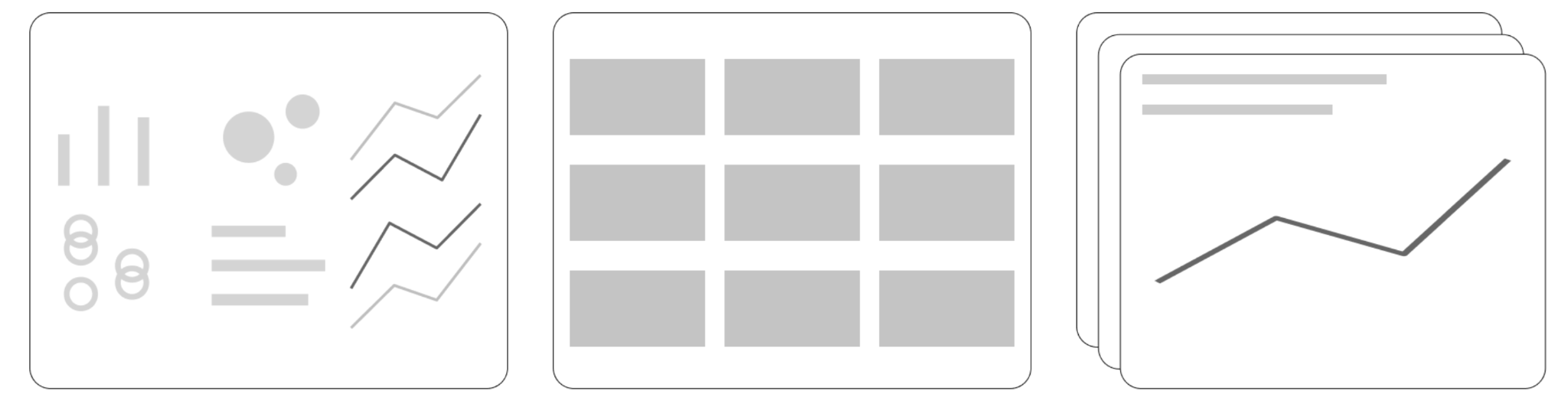
With this inspiration in mind, let’s take a brief look now at its functionality. RemixTape is a presentation authoring tool with multiple views. There’s a presentation canvas where we find scenes containing visualization cards and text cards. We have a browser to collect metrics from different data sources, and a recommendation list of new visualization cards to add to the canvas.
Speaking to our first design imperative of arranging and semantically aligning sequences of charts, we implemented interactions on cards that allow us to slice and dice charts, as well as juxtapose and coordinate charts by truncating and relativizing their scales and when two charts are adjacent, we reveal an affordance to merge them and superimpose their metrics.
Speaking to our second design imperative of adding situational context to charts, we added functionality to both annotate + obfuscate parts of charts along with the ability to add free-form text commentary and interactively coordinate a text card with its adjacent visualization card with linked temporal highlighting:

And finally, our third imperative was to provide context-aware recommendations of complementary metric charts that enrich a partially-constructed narrative sequence. These could be recommendations of broader overview views of metrics already on the canvas, or views that zoom in on notable spikes or troughs, recommendations to break down a metric by a categorical dimension, and cold start recommendations of metrics exhibiting notable variation, a type of recommendation which I’ll reflect on momentarily.
.gif")
Finally, there’s a presentation mode of the app that hides the authoring UI, which could be used as an interactive alternative to presenting static slides.
Scenario
On my YouTube channel you’ll find a 5 minute end-to-end scenario depicting how a real-estate analyst remixes metrics from residential listings, COVID-19 cases, and weather to construct a presentation about real estate trends.
Evaluating RemixTape
In the evaluation of RemixTape that we conducted with six enterprise data professionals, we asked them to reproduce and then extend a narrative presentation involving several sets of metrics, our full methodology and observations can be found in the paper. For now, I’ll focus on our key high-level takeaways from this evaluation. First, in this post-dashboard era of business intelligence, product designers should exercise caution when proposing alternative narrative BI experiences that deviate from the expected conventions of dashboard or slide presentation interfaces. Second, designers should consider scene + card-based presentations about metrics with cards of varying visibility and prominence, and by that I mean thinking about selectively hiding and showing cards, or allowing for multiple levels of hierarchy between canvas, scene, and card. Third, with respect to recommendations, their scope should be narrow: otherwise, recommendation features give an impression that the application is intended for exploratory data analysis rather than for communicating narratives.
Next Steps
Plans to productize aspects of RemixTape are unknown at the time of writing, though two patents related to the project were issued in 2025: Semantic alignment of text and visual cards to present time series metrics (US12229856B2) and Visualization recommendations for time-series metrics presentations (US12260478B2). Several additional patent applications are pending.
In terms of functionality, one potential future consumption experience for interactive RemixTape narratives could be a swipe-able sequence of cards embedded into a communication / collaboration platform like Slack or Teams (echoing an approach from our 2024 VIS paper).

Finally, with respect to future research directions, RemixTape represents a point in a nascent design space for visualization remixing, one worthy of further exploration. It also serves as a call to mine the interface and interaction design paradigms of music production for applications to visualization and visual analytics.