
The Choreography of Augmented Reality Timelines
Studying the Relative Position, Chronology, & Situatedness of Event Sequences


This post is a summary of our paper “The Choreography of Augmented Reality Timelines: Studying the Relative Position, Chronology, & Situatedness of Event Sequences” by Isabelle Kwan, Jessica Ziyu Chen, and Matthew Brehmer, in proceedings of the 2026 CHCCS / SCDHM Graphics Interface Conference (GI). Read the pre-print, watch the video, or check out the code. Isabelle presented the paper at GI on Wednesday, June 10, 2026, and what follows is based on her talk.
Timelines have always been an important way for us to communicate historical, biographical, and personal stories. However, current tools restrict our abilities to effectively share temporal data holistically.
The most common timelines, such as the one above, are easy to interpret because they follow a clear 2D, linear structure, but they can be restrictive in expressing smaller nuances. More flexible timelines, such as the work done in TimeSplines, can better capture how people experience and remember events, but often become harder to interpret.
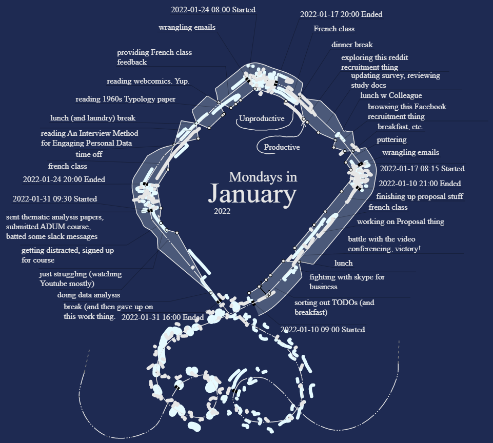
Timelines are also commonly tied to 2D representations, even though prior work shows that people visualize time in more than two dimensions. For example, in Visualizing Time by Camilla Torna, many participants sketch time in cyclical, stacked, and looping shapes.
This led us to ask:
How can historical and biographical timeline representations remain interpretable while allowing people to express more flexible and meaningful spatial structures? …And how could these structures interact with the spaces around us?
To explore this question, we made three contributions:
A formative, observational study examining how people naturally arrange timelines in physical space.
A proof-of-concept AR timeline application informed by those findings.
Reflections on design implications and future opportunities for personal storytelling and museum experiences.
Formative Study
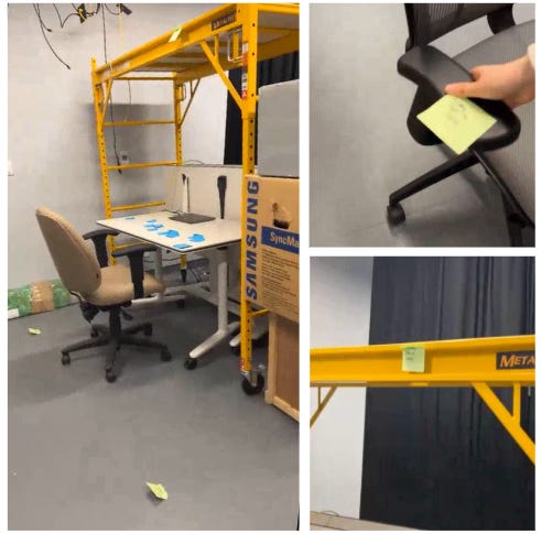
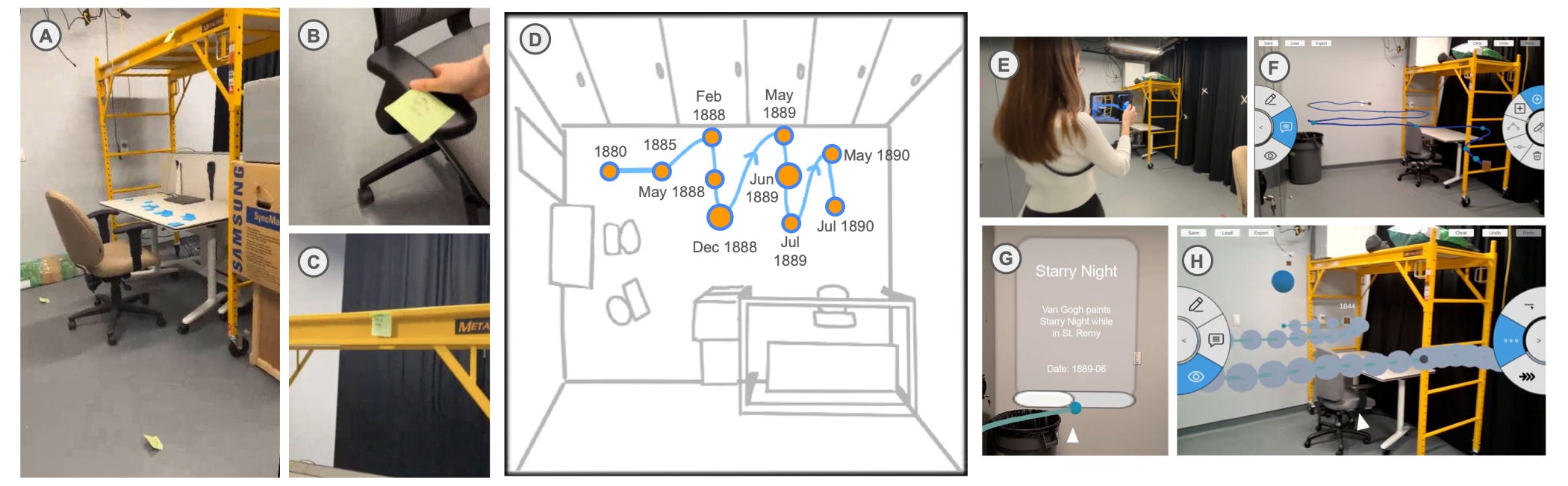
Our formative study consisted of 2 parts. In the first part of the study, 12 participants organized historical datasets, such as Van Gogh’s biography or Taylor Swift’s album releases. They placed sticky notes around our study room and indicated verbally if they wanted to make data points float in midair or attach to certain artifacts. Afterwards, the participants created their own timeline datasets using personal events and stories to place around the room in the same way.
In the second part of the study, nine participants repeated the activity in a familiar environment of their choice, such as their dorm or kitchen, using the same personal data generated in the first part of the study. Both parts of the study were filmed in first person perspective.
Through this formative study, we observed 3 main themes from the timeline placements: Shape, Chronology, and Role of familiar spaces and objects.
Shape
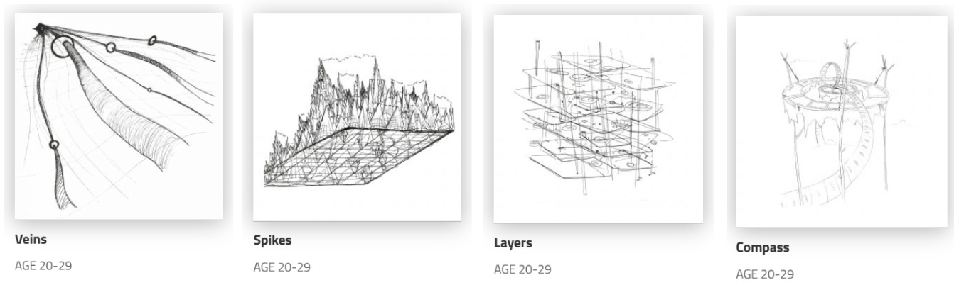
Looking at the created timelines, we found that participants used spatial layout to communicate more than time alone.
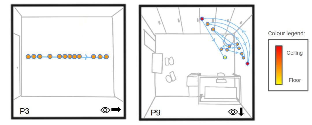
In these images, 2 participants, P3 and P9, placed points for our Taylor Swift dataset. P3 took a traditional, linear approach to the data, placing them along the wall in a literal translation from the dates provided. However, looking at P9, data points were grouped depending on if they were associated with similar emotions or periods of time, creating a timeline shape with complexity and layered meaning.
The key takeaway is that event position reflects emotion, meaning, and environmental affordances.
Chronology
Next, exact temporal distances and chronology was warped by perceived importance.
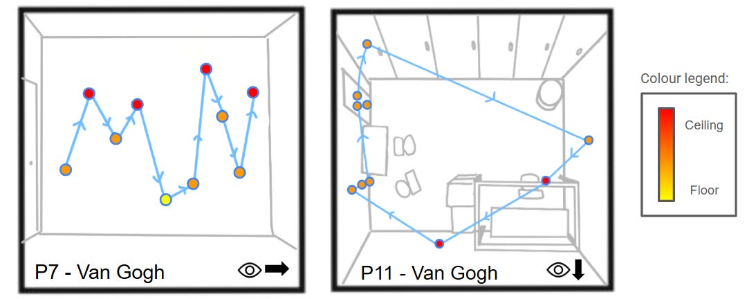
P7 placed data in an equidistant fashion along the x-axis of their timeline, without regard for the actual amount of time between dates. Contrasting this, P11 kept early and late dates clustered together, expanding the space between largely significant events, taking more time during the study to explore the space and find meaningful placements for them.
This suggests that perceived importance often shaped spatial distance more than chronological accuracy.
Role of Familiar Places and Objects
Finally, the role of familiar places and objects was highly impactful in data placement. When participants worked with personal events, they frequently anchored memories to meaningful objects and locations.
For example, P11 moved from attaching events in a 2D manner to 3D when expressing their timeline of their growing appreciation of coffee in an unfamiliar space to the kitchen where a lot of their actual journey took place.
This highlights how familiar spaces and objects can become part of the timeline itself, adding more personal meanings.
Proof of concept prototype
Using the findings from our formative study, we designed a proof-of-concept AR timeline application.
Rather than treating timelines as fixed chronological structures, the goal was to support the more flexible, spatial, and personally meaningful representations that participants naturally created.
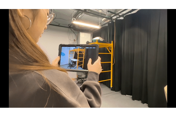
The system has three main components. First, users can draw the overall shape of a timeline by moving through space. Second, they can place and edit events along that path. Finally, viewers can walk through the timeline, experiencing it as a sequence of locations and events rather than a static visualization.
While developing the prototype, one interesting challenge we encountered was how to represent chronology when participants often compressed or expanded time based on meaning rather than actual duration.
To explore this, we created three viewing modes.
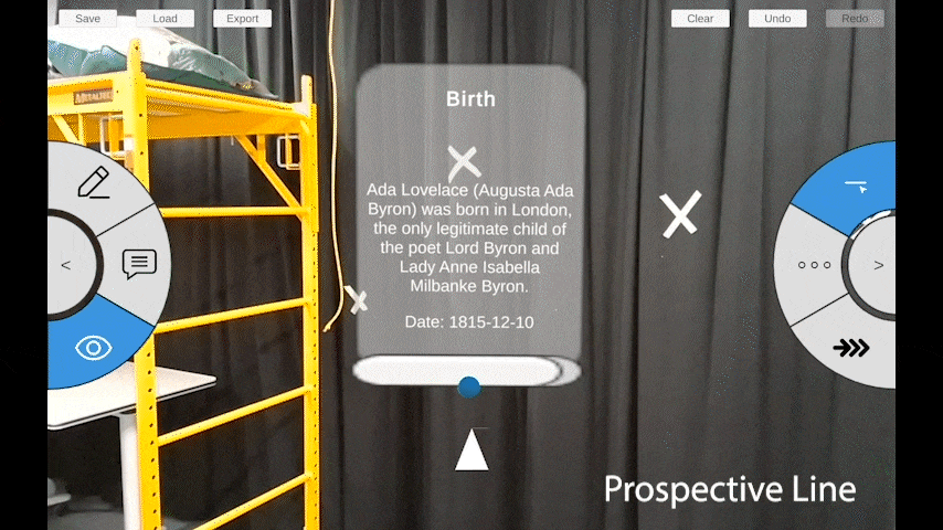
The first mode, “prospective line,” simply connects events in sequence. After each data point is visited, the next segment of the line is revealed and the app’s compass points the viewer to the next location.
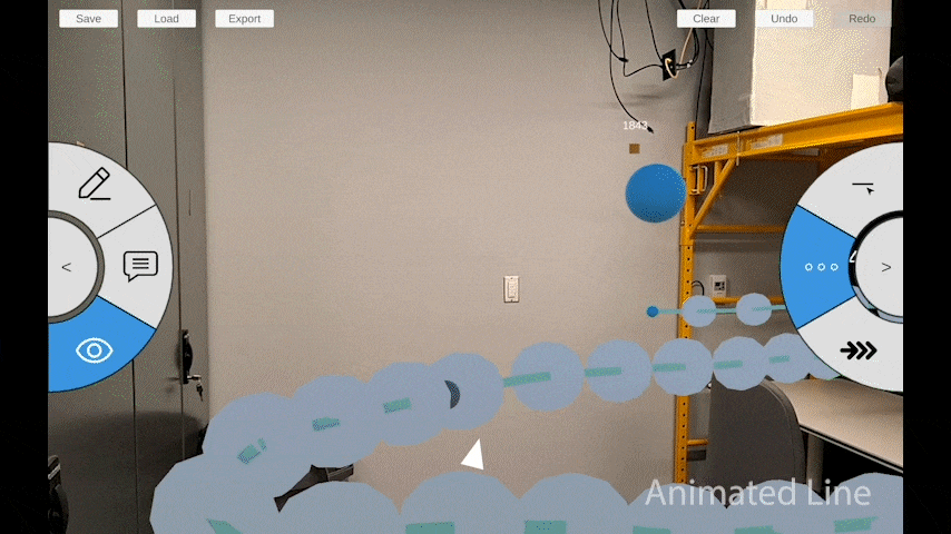
The second mode, “animated line,” uses animated particles and movement speed conveys the passage of time. The faster and more dense the particles are, the closer the data points are in time. The slower and more spread out the particles are, the further the data points are in time.
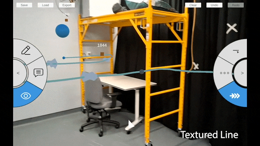
The third mode, “textured line,” uses chevrons along the path to provide a more subtle representation of temporal distance. The more chevrons there are on a line segment, the more time is in between the data points and the less chevrons there are on a line segment, the less time is between the data points.
Together, these modes explore different ways of balancing chronological information with personal interpretation.
Reflection
While this prototype demonstrates how our findings can be translated into an AR experience, it also opens up several directions for future work.
There are three primary directions we see moving forward.
First, we would like to replicate the formative study with the proof-of-concept application to better understand how these timeline experiences support storytelling and interpretation.
Second, we would like to incorporate scene understanding so timelines can respond more intelligently to objects and features in the environment.
And third, we would like to integrate these ideas in personal storytelling, biography, and GLAM (Galleries, Libraries, Archives and Museum) settings, where spatial context can play an important role in how stories are experienced. We would love to see how personal data differs from curated museum type environments.
Conclusion
To conclude, our work shows that when people are given the freedom to represent time in physical space, they naturally use shape, chronology, and environmental context to express meaning. These findings informed the design of our AR prototype and suggest new possibilities for more expressive and situated timeline experiences.
 | A guest post by
|